
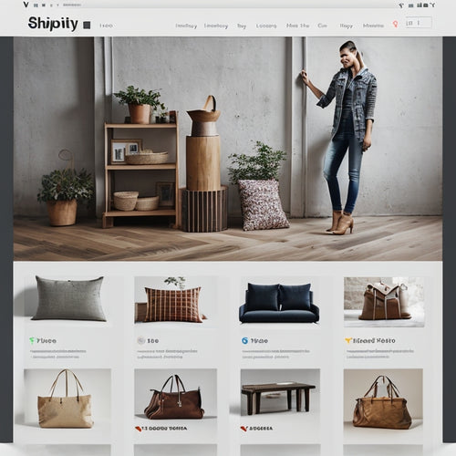
Optimize Your Shopify Store for Mobile Users
In today's mobile-first world, it's crucial to ensure your Shopify store delivers a seamless experience for smartphone and tablet users. By optimizing your store, you can enhance user engagement, increase conversion rates, and boost your sales. Here's a comprehensive guide to help you get started.
Common Mobile Challenges
Before diving into optimization, let's address common challenges mobile users face:
- Slow page loading: Mobile users have limited patience, and slow loading times can lead to frustration and lost sales.
- Difficult navigation: Cluttered menus and hard-to-find products can make it difficult for users to browse and purchase.
- Unresponsive buttons: Buttons that are too small or difficult to tap can hinder user engagement.
- Poor image quality: Blurry or pixelated images can damage your brand's credibility and impact product desirability.
Optimization Strategies
1. Speed Optimization
- Use a mobile-optimized theme: Shopify provides several mobile-friendly themes that are designed to load quickly and look great on all devices.
- Compress images: Large images can slow down your website. Use tools like TinyPNG or JPEGmini to reduce file sizes without compromising quality.
- Enable browser caching: Caching stores website elements on the user's browser, reducing the need for subsequent requests and speeding up page loading.
2. Navigation Optimization
- Simplify your menu: Keep your menu concise and use clear, descriptive labels to help users find what they're looking for quickly.
- Use sticky headers: Make your menu visible at all times, even when users scroll down the page, providing easy access to navigation.
- Utilize breadcrumbs: Breadcrumbs help users track their location within your site and navigate back easily.
3. Button Optimization
- Increase button size: Make sure your buttons are large enough for users to tap comfortably.
- Use clear call-to-actions: Craft compelling calls-to-action that guide users through your checkout process.
- Provide visual feedback: Use hover effects and color changes to indicate button functionality.
4. Image Optimization
- Choose high-quality images: Use sharp, well-lit images to showcase your products and build trust.
- Set appropriate image dimensions: Ensure your images are the right size for mobile screens to avoid distortion or pixelation.
- Use lazy loading: Only load images as they become visible on the page, reducing the initial page load time.
5. Other Best Practices
- Test your store: Use Google's Mobile-Friendly Test tool to check your store's performance and identify areas for improvement.
- Monitor your analytics: Track key metrics like bounce rate and conversion rate on mobile devices to identify potential pain points and optimize accordingly.
- Provide support: Offer easy access to customer support options in case users encounter any issues on their mobile devices.
Conclusion
By implementing these optimization strategies, you can enhance the mobile experience for your Shopify store and unlock new opportunities for growth. Remember, catering to the needs of mobile users is essential for success in today's digital landscape. By creating a user-friendly, fast, and engaging mobile store, you can empower your customers, drive conversions, and establish a strong online presence.
Related Posts
-

Why Optimal Pricing Matters for Online Learning Success
You set your online course prices, but ultimately, they set the tone for your students' perception of value, engageme...
-

Optimizing SEO for Shopify: A Comprehensive Guide
This article provides a comprehensive guide on optimizing SEO for Shopify websites. It covers multiple aspects of SE...
-
Bulk Editing Product Images: The Easy Way to Enhance Your Shopify Store
The process of enhancing an online store's appearance through bulk editing of product images is a valuable feature o...


