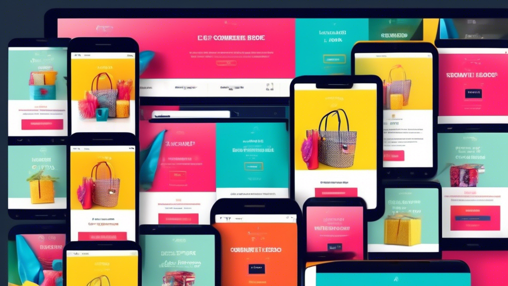
Mobile-First Shopify: Design Tips for Ecommerce Success
In the ever-evolving world of e-commerce, mobile optimization has become an absolute necessity. With the majority of online shoppers browsing and making purchases from their smartphones, it's crucial to ensure that your Shopify store delivers an exceptional mobile experience.
Common Questions and Issues
1. What's the importance of a mobile-first approach?
- Most online traffic now comes from mobile devices.
- Mobile-optimized sites improve user experience and conversion rates.
- Google prioritizes mobile-friendly websites in search results.
2. How can I optimize my Shopify store for mobile?
- Use a responsive theme that adapts to different screen sizes.
- Simplify navigation and make it easy to find products.
- Use large, easy-to-read fonts and buttons.
- Provide clear and concise product descriptions.
3. What are some specific design tips for mobile optimization?
- Use a single-column layout.
- Place the most important content above the fold.
- Use high-quality product images that are optimized for mobile.
- Minimize distractions and keep the design clean.
Conclusion
By following these mobile-first design tips, you can create a Shopify store that provides a seamless and engaging experience for your mobile customers. Remember, a well-optimized mobile store will not only boost your sales but also enhance your brand reputation and customer loyalty.
Related Posts
-

7 Ways Merchants Can Thrive With Online Courses
You can thrive with online courses by diversifying your revenue streams, building brand authority, and creating a loy...
-

Which SEO App Is Best for Shopify
This article aims to provide an objective analysis of the best SEO app for Shopify, catering to the needs of individ...
-
Feed Shopify Apps Simplify the Process of Listing Products on Various Platforms
The process of listing products on various platforms can be simplified through the use of feed Shopify apps. These a...
