
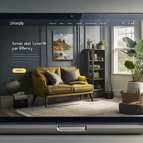
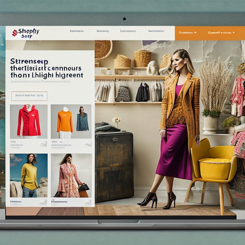
Mobile-First: The Key to Shopify Success
As a dedicated advocate for all things Shopify, I'm thrilled to dive into the topic of mobile-first and its profound impact on achieving success with this platform. In this article, I'll share valuable insights, practical advice, and real-life examples to help you optimize your Shopify store for the mobile-first era.
Why Mobile-First Matters
In today's digital landscape, mobile devices reign supreme. According to Statista, over 50% of global website traffic now comes from smartphones. This shift towards mobile has significant implications for e-commerce businesses.
By embracing a mobile-first approach, you can:
- Enhance user experience for the majority of your customers
- Increase conversion rates by making it easier for users to browse and purchase on their mobile devices
- Improve search engine rankings, as Google prioritizes mobile-friendly websites
Common Questions and Issues
Let's tackle some common questions and issues you may encounter when adopting a mobile-first strategy:
- How do I design a mobile-friendly website? Consider using a responsive theme that automatically adjusts to different screen sizes. Ensure your website has quick loading times and an intuitive navigation structure.
- What are the essential elements of a mobile-first Shopify store? Focus on large, easy-to-tap buttons, concise product descriptions, and a simplified checkout process. Consider implementing mobile-specific features like in-app purchases and push notifications.
- How do I optimize my product pages for mobile? Use high-quality product images that showcase your products effectively. Write clear and concise descriptions that highlight key benefits. Enable customer reviews and ratings to build credibility.
Real-Life Success Stories
Let's delve into a few inspiring success stories of Shopify stores that have embraced the mobile-first approach:
Case Study #1: MVMT Watches
By implementing a mobile-first design, MVMT Watches experienced a 30% increase in mobile conversions. Their simplified navigation and optimized product pages made it easy for users to browse and purchase watches on the go.
Case Study #2: Chubbies Shorts
Chubbies Shorts redesigned their mobile website with a focus on user experience. They implemented a Quick Shop button that allowed users to purchase products with just a few taps. This resulted in a significant boost in sales and customer satisfaction.
Conclusion
Embracing a mobile-first approach is no longer an option but a necessity for Shopify store owners who want to stay competitive in today's digital marketplace. By following the tips outlined in this article, you can create a mobile-friendly website that enhances user experience, increases conversions, and unlocks the full potential of your Shopify store.
Related Posts
-
How Do I Optimize My Shopify Speed
The optimization of Shopify speed is a topic of interest for many online businesses seeking to enhance their website...
-
What Is the Best Faq App for Shopify
This article aims to provide an objective analysis of the best FAQ app for Shopify, catering to an audience seeking ...

