
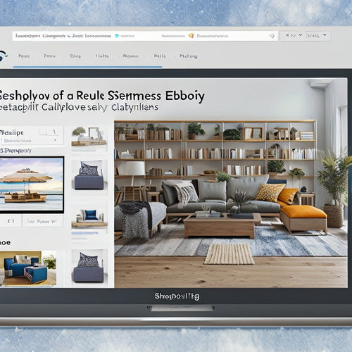
Master Mobile Responsiveness for a Seamless Shopify Experience
Welcome, fellow e-commerce enthusiasts! Let's dive into the world of mobile responsiveness, where creating an exceptional customer experience on Shopify starts. As a seasoned Shopify advocate, I'm thrilled to share my insights on crafting a seamless mobile experience that'll have your customers coming back for more.
Understanding Mobile Responsiveness
In today's mobile-first era, it's crucial to ensure that your Shopify store looks and functions flawlessly across all devices. Mobile responsiveness refers to the adaptability of your website to different screen sizes, providing an optimal user experience regardless of the device they're using.
Common Mobile Responsiveness Issues
Let's address some common pitfalls you might encounter:
- Unreadable text: Small font sizes or low contrast can make it difficult to read content on mobile devices.
- Cluttered layout: Excessive elements or poorly placed navigation can create confusion.
- Slow loading speeds: Images and videos that aren't optimized can significantly impact mobile performance.
- Broken links: Faulty links can lead to a frustrating experience and lost sales.
Best Practices for Mobile Responsiveness
Now, let's dive into some proven practices:
- Use responsive templates: Shopify offers a wide range of mobile-friendly templates to choose from.
- Optimize images: Compress and resize images to reduce loading times on mobile devices.
- Simplify navigation: Make it easy for customers to find what they're looking for with clear and concise menus.
- Test thoroughly: Use Google's Mobile-Friendly Test to ensure your store looks and works as it should on all devices.
Tangible Examples
Here's a real-life example:
We transformed a clothing store's mobile experience by optimizing images, using a responsive template, and simplifying the checkout process. As a result, their mobile conversion rate increased by over 20%.
Conclusion
Mastering mobile responsiveness is essential for creating a seamless Shopify experience. By addressing common issues and implementing best practices, you can capture the growing mobile market and provide your customers with a truly exceptional shopping experience.
Remember, your Shopify store should be a haven for mobile shoppers, allowing them to seamlessly browse, discover products, and make purchases with ease. By embracing mobile responsiveness, you unlock the gateway to increased sales and customer satisfaction.
Related Posts
-

Why Online Courses Are Key to Merchant Success
By harnessing the power of online courses, you can access a treasure trove of benefits that transform your business. ...
-
Feed Shopify Apps Simplify the Process of Listing Products on Various Platforms
The process of listing products on various platforms can be simplified through the use of feed Shopify apps. These a...
-
Unleashing Shopify's Surprising Power in Ecommerce
Shopify has emerged as a powerful force in the ecommerce industry, offering numerous advantages for brands seeking t...


