
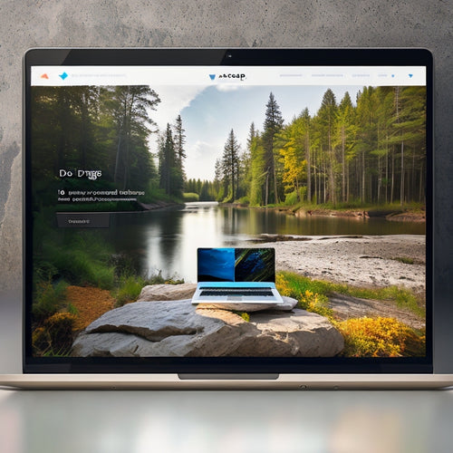
Mobile-First Shopify: Optimizing Themes for Smartphones
In the realm of e-commerce, mobile reigns supreme. With the proliferation of smartphones, it's no longer an option but a necessity to ensure your Shopify store delivers a seamless experience on all devices. Enter mobile-first design – the key to unlocking the full potential of your m-commerce empire.
Navigating the Mobile Maze
When it comes to mobile optimization, there's no room for guesswork. Let's delve into the common pitfalls and their remedies:
- Tiny Text: Ensure your font sizes are readable across all devices, adjusting them dynamically based on screen size.
- Cluttered Design: Streamline your mobile layout, eliminating unnecessary elements and optimizing image sizes for faster loading.
- Inaccessible Menu: Make sure your menu is easily accessible from any page, using a hamburger icon or a dedicated mobile navigation.
Embracing the Mobile-First Mantra
To truly grasp the mobile-first approach, imagine yourself browsing your store on a smartphone. Consider the user flow, the ease of navigation, and the overall experience you want to create. Then, let that vision guide your design decisions.
Here are some practical tips for implementing mobile-first optimization:
- Test Thoroughly: Use mobile emulators and real devices to test your theme's responsiveness and functionality across different screen sizes.
- Simplify Navigation: Reduce the number of clicks required to find products and complete purchases.
- Implement Dynamic Image Scaling: Ensure images automatically adjust to match screen size and resolution, optimizing load times.
Unlocking the SEO Advantage
Mobile-first optimization not only enhances the user experience but also has SEO benefits. Google prioritizes mobile-friendly websites in search results, giving you a competitive edge.
To optimize your theme for SEO, focus on:
- Mobile Responsiveness: Use a mobile-responsive theme that adapts to any device.
- Fast Load Times: Optimize your theme for fast loading speeds, as this is a key ranking factor.
- Structured Data: Implement structured data to help search engines understand your content and display it in rich snippets.
Personalizing the Experience
Go beyond responsive design and create a truly personalized mobile experience for your customers. Consider these strategies:
- Location-Based Marketing: Use geo-targeting to display relevant products and promotions based on customer location.
- Push Notifications: Send targeted push notifications to keep customers engaged and informed about promotions and new arrivals.
- Mobile-Optimized Content: Create mobile-specific content, such as product videos and blog posts, tailored to the smaller screen.
Conclusion
By embracing mobile-first Shopify optimization, you unlock a world of possibilities for your e-commerce store. From improved user experience to SEO advantages, a mobile-optimized theme is the cornerstone of your m-commerce success. So, embrace the mobile revolution and watch your store soar to new heights.
Related Posts
-
How Do I Import Products From Any Website to Shopify With This App
This article explores the process of importing products from any website to Shopify using a specific app. It aims to...
-

How Do I Upload a Sitemap XML to Shopify
This article examines the process of uploading a sitemap XML to the Shopify platform. The objective of this technica...
-
Unlocking the Power of Private Shopify Apps
This article explores the advantages and operational capabilities of private Shopify apps. Private apps are construc...


