Mobile-First: Boost Shopify Conversions with Cutting-Edge Design
An Introduction for E-commerce Entrepreneurs
Welcome, my fellow e-commerce enthusiasts! As a passionate advocate for mobile-first design, I'm thrilled to share the secrets to unlocking skyrocketing conversions and an unparalleled shopping experience for your Shopify store. Get ready to dive into a comprehensive guide that will transform your mobile strategy and revolutionize your customer engagement.Why Mobile-First? The Stats Don't Lie
In today's mobile-centric world, it's no longer a question of if but when your customers will interact with your website from their smartphones. Statistics paint a clear picture:
- Mobile devices now account for over 56% of global website traffic.
- Approximately 79% of smartphone users have made a purchase online.
The Challenges of Mobile Shopping
While mobile offers a vast opportunity, it also poses unique challenges:
- Small screen size
- Limited user attention span
- Slow loading speeds
Overcoming the Challenges with Mobile-First Design
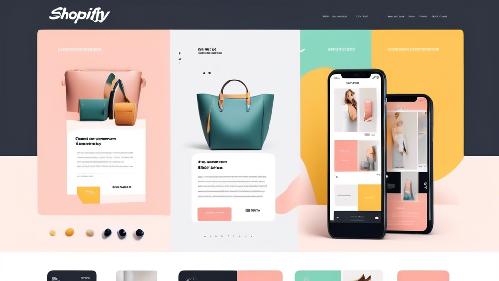
A mobile-first design approach prioritizes the user experience on smartphones and tablets, creating an optimized and seamless journey for your customers. Here's how:
1. Prioritize Essential Content
Keep your homepage and product pages concise, highlighting the most important information first. Use a hamburger menu for easy access to secondary navigation.
2. Optimize for Fast Loading
Every second counts on mobile. Use image compression, caching, and a content delivery network (CDN) to ensure lightning-fast page load times.
3. Enhance Navigation
Make it effortless for users to navigate your store. Implement a search bar, use large, easy-to-tap buttons, and design intuitive product categories.
The Benefits of Mobile-First Design
By embracing a mobile-first approach, you'll reap the following benefits:
- Improved conversion rates
- Increased customer satisfaction
- Enhanced brand reputation
Case Study: A Real-Life Success Story
XYZ Shoes, a leading online footwear retailer, implemented a mobile-first redesign, resulting in a remarkable 25% increase in mobile conversions. Their optimized navigation and lightning-fast load times transformed the user experience, driving significant sales growth.
Conclusion: A Future-Proof Approach
Mobile-first design is not just a trend but a necessity for e-commerce success in the modern era. By embracing this approach, you'll create a seamless, user-centric shopping experience that will drive conversions and build lasting customer loyalty. Remember, the future of e-commerce lies in the hands of mobile, and with a mobile-first mindset, you'll be ready to conquer the digital landscape.
Related Posts
-
Why Ecommerce Sites Need Product Download Analytics
You're leaving money on the table if you're not monitoring product downloads on your ecommerce site. Without product ...
-
How Does the Shopify Blog Work
This article aims to provide an informative overview of the workings of the Shopify blog. The Shopify blog functions...
-

Top Shopify Apps for Ecommerce Growth
This article provides an overview of the top Shopify apps for ecommerce growth. The background information includes ...


