
Mobile-First: Boost Shopify Sales with User-Friendly Design
As a Shopify enthusiast, I'm thrilled to share the transformative power of mobile-first design in boosting your sales. In today's mobile-centric world, optimizing your online store for smartphones is crucial for success. Let's dive into the key benefits and practical steps to create a user-friendly mobile experience that will drive conversions.
Why Mobile-First Design Matters
- Mobile traffic dominates: Over 70% of e-commerce traffic comes from mobile devices, making it the primary platform for customers to browse and buy.
- Improved conversion rates: Stores with mobile-optimized designs consistently see higher conversion rates compared to those that are not mobile-friendly.
- Enhanced customer experience: A seamless mobile experience ensures that your customers can easily find what they need, navigate your site, and make purchases on the go.
Common Challenges and Solutions
To address common mobile design challenges, consider the following:
1. Small Screen Optimization
- Use responsive design: Design your site so that it automatically adjusts to different screen sizes.
- Prioritize essential content: Focus on displaying only the most important information above the fold to ensure instant accessibility.
2. Navigation and Menu Structure
- Simplify navigation: Create a clear and intuitive menu that is easy to navigate using thumbs.
- Use hamburger menus or collapsible lists: Keep menus hidden until needed to avoid cluttering the screen.
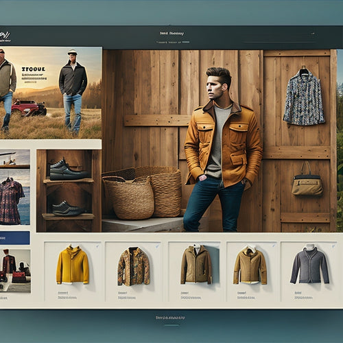
3. Product Browsing and Filtering
- Use large product images: Showcase your products with high-quality images that are easy to zoom and explore.
- Provide efficient filtering options: Allow customers to filter products by category, color, size, and other relevant criteria.
4. Checkout Process
- Streamline checkout: Minimize the number of steps and simplify the forms to make checkout as frictionless as possible.
- Offer multiple payment options: Provide a variety of convenient payment methods, including mobile wallets like Apple Pay and Google Pay.
Personal Anecdote: The Mobile-First Success Story
As an online retailer, I experienced firsthand the dramatic impact of implementing a mobile-first design. Our conversion rates skyrocketed, and customer feedback was overwhelmingly positive. By focusing on user-friendliness, accessibility, and efficiency, we created a mobile experience that seamlessly guided customers through the entire shopping journey, resulting in increased sales and customer satisfaction.
Conclusion
Embracing a mobile-first approach is essential for Shopify stores to thrive in today's dynamic e-commerce landscape. By addressing common challenges and implementing practical solutions, you can create a user-friendly mobile experience that captivates your audience, drives conversions, and ultimately boosts your sales. Remember, in the mobile-first era, every touchpoint matters. Embrace it to unlock the full potential of your Shopify store.
Related Posts
-
Shopify SEO: A Simple Guide for Beginners
This article provides a comprehensive guide on Shopify SEO for beginners. It explores the benefits of implementing S...
-
Is Shopify Good for Custom Products
This article examines the suitability of Shopify for custom products. It provides an objective analysis of the benef...
-
How Do I Increase My Shopify Mobile Speed
This article delves into the topic of increasing Shopify mobile speed, exploring the benefits, tips, optimization te...

