
7 Best Mobile Optimization Strategies for Merchants
You know how frustrating slow-loading mobile sites and confusing checkout processes can be, and so do your customers. To stay ahead of the competition, you need to implement effective mobile optimization strategies. Start by simplifying navigation and search, then optimize your product page design for clear layouts and fast-loading images. Guarantee your content is mobile-friendly, and streamline your checkout process to reduce friction. Don't forget to improve mobile page speed and utilize responsive web design for a seamless user experience. By mastering these strategies, you'll be well on your way to converting mobile browsers into buyers - and that's just the beginning.
Key Takeaways
• Implement a responsive design that adapts to different screen sizes to ensure a consistent user experience across devices.
• Optimize product pages with clear layouts, high-quality images, and simplified product details to improve user engagement.
• Simplify navigation and search functionality with concise menus, autocomplete suggestions, and filters to reduce friction points.
• Streamline the checkout process by providing trust badges, mobile wallets, and guest checkout options to increase conversions.
• Prioritize mobile page speed optimization by compressing images, leveraging browser caching, and minifying code to provide a seamless user experience.
Simplify Navigation and Search
To ensure a smooth mobile shopping experience, simplify your site's navigation and search functionality, allowing customers to quickly find and purchase products on-the-go. A cluttered navigation menu can lead to frustration and high bounce rates. You must guarantee that your site's navigation is intuitive, concise, and easy to use on smaller screens.
This means minimizing the number of clicks required to reach a product page and using clear, descriptive labels for menu items. Additionally, prioritize search functionality, making it easily accessible and visible on every page. This will enable customers to quickly find specific products, reducing the likelihood of cart abandonment.
A responsive design is also important, ensuring that your site adapts seamlessly to different screen sizes and devices. By streamlining navigation and search, you'll greatly enhance the overall user experience, driving conversions and revenue. Remember, a well-designed mobile site is essential for staying competitive in today's e-commerce landscape.
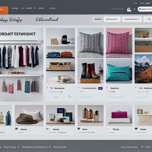
Optimize Product Page Design
When you're designing your product pages for mobile, you'll want to prioritize a clear and concise layout that makes it easy for customers to find what they need.
You'll need to simplify your product layout, ensuring that key details like pricing and product descriptions are prominent and easily accessible.
Simplify Product Layout
By streamlining your product page design, you can significantly enhance the shopping experience for mobile users and increase conversions. A cluttered page can overwhelm users and lead to abandoned carts. To avoid this, focus on a minimal design that's user-friendly and easy to navigate.
Here are some key elements to prioritize:
-
Clear product images: Make sure they're large enough to view on smaller screens, but not so large that they slow down page loading.
-
Prominent calls-to-action: Guarantee that 'Add to Cart' or 'Buy Now' buttons are easy to spot and tap.
-
Concise product descriptions: Break up text into short paragraphs or bullet points to make it easy to scan.
- Simple product variations: Use dropdown menus or accordions to simplify the selection process for users.
Enhance Image Quality
You can boost mobile conversions by ensuring your product images are of high-quality, sharp, and well-lit, as subpar visuals can instantly deter potential customers.
When it comes to image optimization, you need to strike a balance between visual appeal and loading speed. High-quality images can markedly slow down your page loading time, leading to frustrated customers and high bounce rates. To avoid this, you should compress your images using tools like TinyPNG or ImageOptim. This will reduce the file size without compromising on quality.
Optimizing your images won't only improve the visual appeal of your product pages but also enhance the overall user experience. Make sure to use descriptive alt tags and file names that include target keywords, as this will improve your search engine rankings.
Additionally, consider using lazy loading or progressive image loading to reduce the initial load time. By prioritizing image optimization, you can create a seamless and engaging shopping experience that drives conversions and sets you apart from the competition.
Leverage Mobile-Friendly Content
Optimizing your website's content for mobile devices is essential, as it directly impacts how easily customers can browse and purchase from your online store on their smartphones. By leveraging mobile-friendly content, you can greatly improve content engagement and user experience, leading to increased conversions and sales.
Here are some key considerations to keep in mind:
-
Use brief, succinct paragraphs that are easy to read on smaller screens.
-
Adjust font sizes and styles to ensure clear readability.
-
Utilize high-quality, compressed images that load quickly and don't slow down your website.
- Prioritize above-the-fold content to immediately capture users' attention.
Enhance Checkout Process Flow
When you're optimizing your mobile checkout process, you'll want to focus on making it as seamless and efficient as possible.
You can start by simplifying your payment options, reducing the number of steps customers need to take to complete their purchase.
Simplify Payment Options
To decrease cart abandonment rates, merchants can greatly streamline the checkout process by condensing payment choices into a single, intuitive page that minimizes friction and confusion. This approach guarantees a seamless user experience, building trust and confidence in your payment security.
By simplifying payment options, you can:
-
Limit choices to the most popular payment methods, such as credit cards, PayPal, and Apple Pay, to reduce overwhelm and decision fatigue.
-
Clearly exhibit trust badges and security certificates, like SSL and VeriSign, to alleviate concerns about payment security.
-
Integrate mobile wallets like Google Pay and Samsung Pay, allowing customers to quickly and easily complete transactions.
- Provide a guest checkout option, eliminating the need for customers to create an account, which can be a major conversion rate killer.
Streamline Order Summary
You can greatly enhance the checkout process flow by distilling your order summary into a concise, easy-to-understand format that eliminates unnecessary details and clearly outlines the total cost, payment method, and shipping information. This streamlined approach will notably reduce cart abandonment rates and improve overall customer satisfaction.
Here's a breakdown of what your order summary should include:
| Element | Description | Benefits |
|---|---|---|
| Total Cost | Clearly display the total cost, including taxes and shipping | Reduces confusion and surprises |
| Payment Method | Show the selected payment method, such as credit card or PayPal | Builds trust and confidence |
| Shipping Info | Outline shipping details, including estimated delivery time and cost | Sets clear expectations |
Improve Mobile Page Speed
Optimizing mobile page speed necessitates a profound understanding of the factors impacting load times. This includes server response, image compression, and caching. You need to identify and address these bottlenecks directly to provide a seamless user experience.
Here are 4 key areas to focus on:
-
Optimize server response: Guarantee your server is configured to handle high traffic and can promptly respond to user requests.
-
Compress images: Decrease the file size of images to minimize the data that needs to be transmitted, resulting in quicker load times.
-
Leverage browser caching: Permit frequently-used resources to be stored locally on users' devices, reducing the necessity for repeated requests to your server.
- Minify and compress code: Eliminate unnecessary characters and compress your code to reduce its overall size, making it quicker to download and execute.
Utilize Responsive Web Design
By guaranteeing that your site's layout adapts seamlessly to various screen sizes and devices, you can provide a consistent and engaging user experience across different platforms. This is where responsive web design comes in – a critical aspect of mobile optimization.
With a responsive website, you can cater to the growing mobile traffic and boost conversion rates. A responsive design guarantees that your site's layout, content, and visuals adjust automatically to fit different screen sizes and devices, providing an ideal mobile user experience.
Streamline Mobile Shopping Experience
Simplifying navigation and condensing checkout processes are crucial steps in streamlining the mobile shopping experience, allowing customers to quickly and easily locate what they need and complete their purchases on-the-go. As a merchant, you want to make sure that your mobile design is optimized for a seamless user experience.
This involves reducing friction points that can result in cart abandonment and increasing conversions.
Here are some key areas to focus on:
-
Streamline search functionality: Make it effortless for customers to find what they're searching for with an intuitive search bar and relevant autocomplete suggestions.
-
Shorten checkout steps: Divide the checkout process into fewer, more manageable steps to lessen friction and anxiety.
-
Enhance product pages: Guarantee that product information is clear, concise, and easily accessible, including high-quality product images and customer reviews.
- Incorporate a guest checkout option: Permit customers to checkout swiftly without needing to create an account, reducing the chance of cart abandonment.
Frequently Asked Questions
How Do I Ensure a Seamless Transition Between Mobile and Desktop Sites?
'Step into the 21st century, my friend! To guarantee a smooth shift, you'll want to prioritize user experience through cross-device consistency, while also optimizing performance for lightning-fast loading speeds that leave users breathless.'
Can I Use a Separate Mobile Site Instead of a Responsive Design?
You're considering a separate mobile site, but weigh the pros and cons: easier development, but potential duplicated effort and inconsistent user experience. Compare this to responsive design, which adapts to devices, but may require more complex coding.
Do I Need to Optimize My Website for Tablets as Well as Smartphones?
'Like a master chef plating a dish, you're crafting a seamless user experience; optimizing for tablets is vital, as it can boost conversion rates by up to 20%, and aligns with growing mobile traffic trends.'
How Often Should I Test and Update My Mobile Optimization Strategy?
You should test and update your mobile optimization strategy regularly, ideally every 2-3 months, to guarantee seamless mobile responsiveness and adapt to changing user behaviors, device trends, and Google's algorithm updates.
Are There Any Specific Mobile Optimization Tools I Should Be Using?
You'll want to leverage A/B testing tools to refine your mobile optimization strategy, tracking user experience metrics and mobile SEO to boost conversion rates; consider tools like Google Optimize, VWO, or Unbounce to maximize your mobile ROI.
Related Posts
-
Understanding Shopify Sitemaps: Beginner's Walkthrough
Through the exploration of Shopify benefits, tips for e-commerce businesses, and helpful tutorials for Shopify SEO, ...
-
How Do I Add Unlimited Products to Shopify
This article explores the process of adding unlimited products to the Shopify platform, a popular e-commerce solutio...
-

Abandoned Cart Apps Target Potential Lost Sales by Reminding Customers Who Left Items in Their Carts. Examples Include Cart Recovery Email Reminders, Exit-Intent Pop-Ups, and SMS Reminders for Cart Items.
Are you tired of losing potential sales from customers who abandon their shopping carts? Abandoned cart apps are her...

